
Prevent Cancer Foundation
Refreshing a web experience to promote early detection
Work

The National Center for Diligent Recruitment is a national project working to improve outcomes for children and youth in foster care by providing free services to help states, tribes, and territories transform how they develop and implement strategic, data-driven diligent recruitment plans. They are funded by the United States Department of Health and Human Services, Administration for Children and Families and the Children’s Bureau.
Launched in 2023, the National Center for Diligent Recruitment came to Teal looking to create a visual identity for their new organization, build a robust website, and establish a foundational digital strategy that would both introduce them as a new organization, and continue to sustain them for years to come.
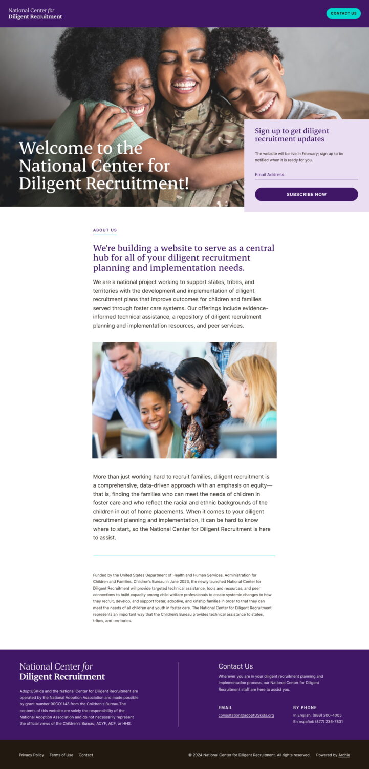
NCDR was under a tight deadline to stand up a digital presence within a matter of weeks. We began our work with a “start small and build over time” philosophy. Our immediate first step was to launch a landing page introducing The National Center for Diligent Recruitment to child welfare professionals and provide a base set of tools to help them in their work. The landing page also incorporated a base visual identity that included a logo, color palette and brand fonts. This gave NCDR enough to establish a presence, while still being able to move quickly.
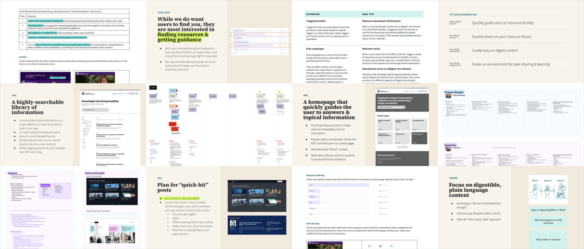
With the initial landing page live, we turned our focus to developing a wholistic digital strategy that would act as the framework for website, email, and social media initiatives going forward. Through a series of deep-dive discovery sessions, audience research and user testing, Teal developed a robust digital strategy that identified four key areas for NCDR to focus:
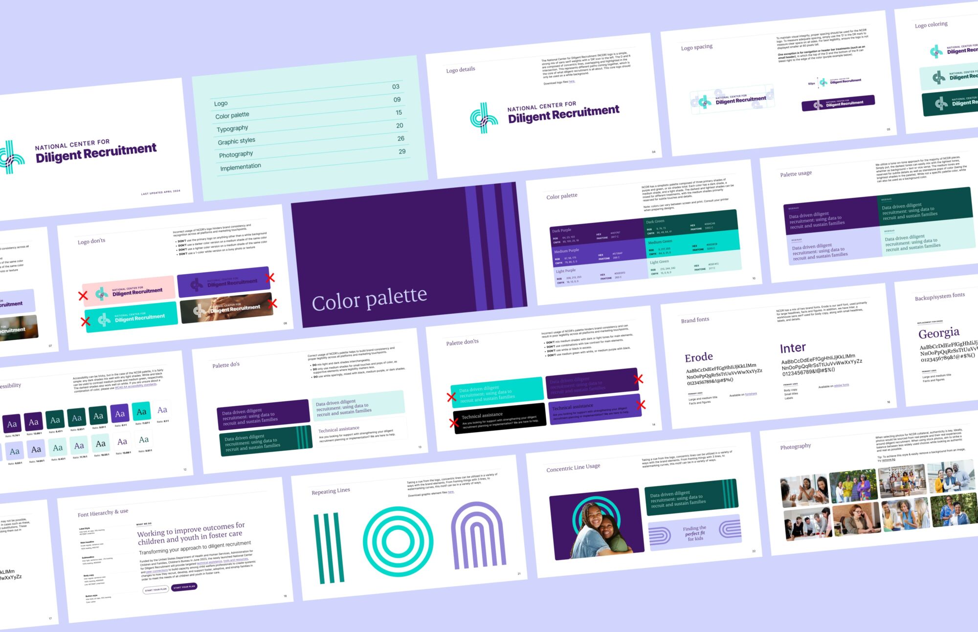
NCDR focused on a simplistic word mark that is strong, minimal and modern. This is supported with a unique mark combining overlapping “D” and “R” letterforms. The multiple paths within the letterforms represent the diligent recruitment process as a whole, with so many paths to find the best fit and outcome for those involved. Sometimes they align, and sometimes you need to keep trying, but you are always moving forward. The overlap of the mark is where we succeed, connecting the right child with the right parent.
The DR symbol is used to influence the patterns and graphic elements throughout the brand, using concentric circles to highlight, lines to draw the eye, and patterns to support. The bold, tone-on-tone styling of purple and teal help bring more visual interest to content that can be more wordy and harder to digest. All elements combine for a smart, clean, authoritative style with a friendly, human touch.

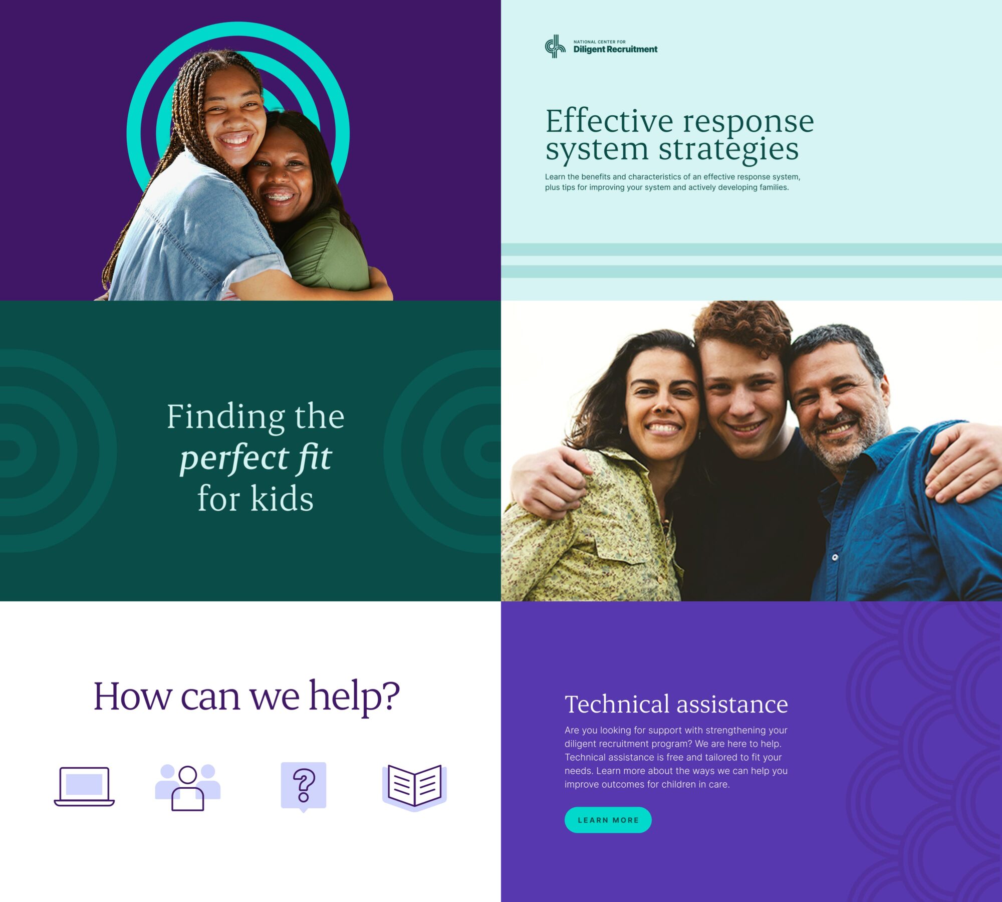
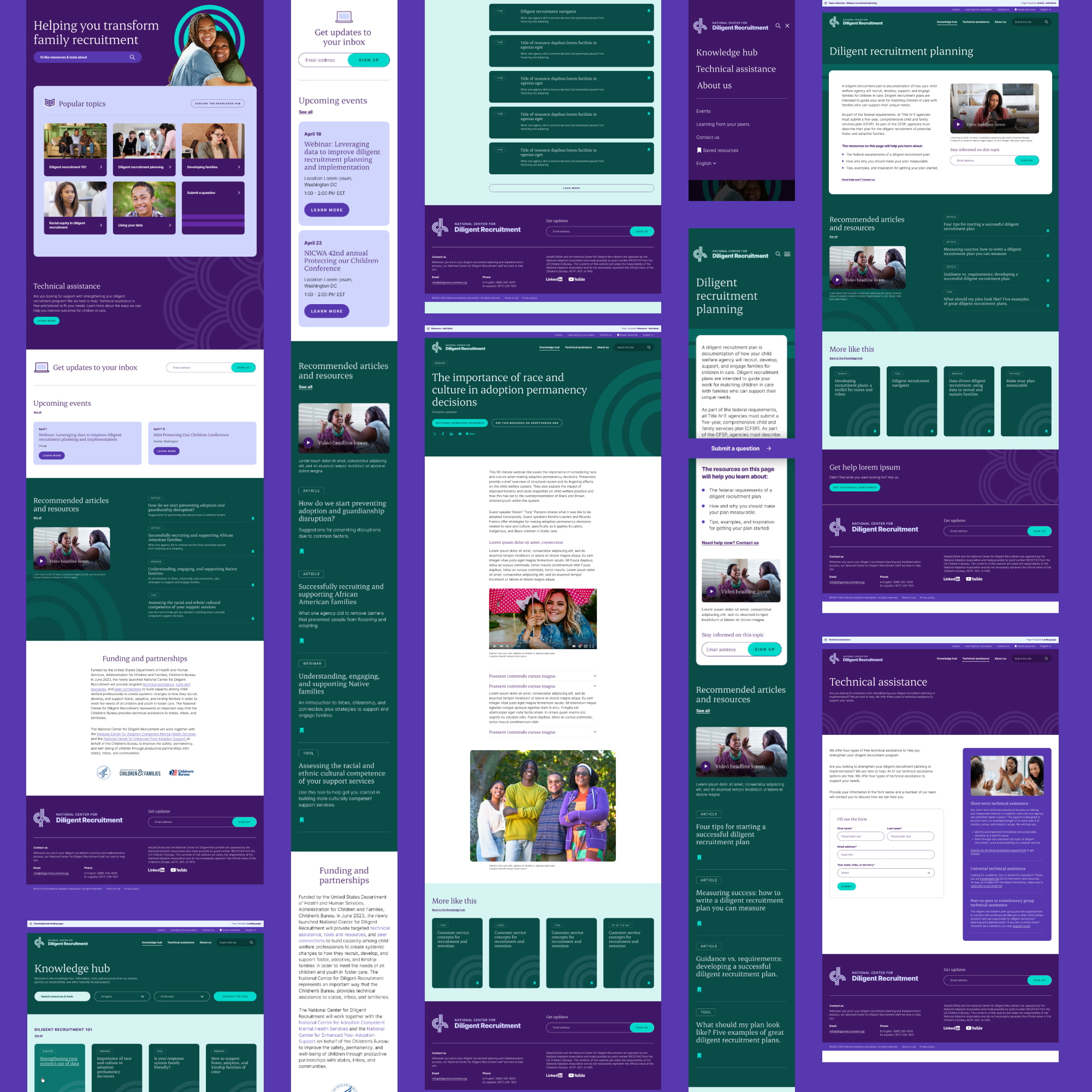
With all the building blocks in place, we built a comprehensive website grounded in our digital strategy. The friendly user interface provides an easy experience for child welfare professionals to search for resources and tools in ways that are most intuitive to them. Users can easily find popular topics, get direct help, easily skim and digest resources and find ways to connect with their peers.


Refreshing a web experience to promote early detection


The part where we ask you to cough up your email. So we can discuss all the amazing things we’re gonna do together. No pressure. Really.