
Kresge Arts in Detroit
Reimagining the website for Kresge Arts in Detroit that celebrates and invests in the city's artists
Work


All Rise had a fairly unique situation – a branding project with one overarching logo, but with the need to create division logos within it (and allow for the smooth addition of others in the future). We started with the logical step, figuring out the All Rise logo. Through several rounds of exploration & refinement, we finalized a logo that shows what All Rise is all about – uplifting others, helping people through the justice system, and always progressing forward. It even hides a nod to its original 4 divisions within the mark itself, marking this moment forever, no matter how much further All Rise expands.
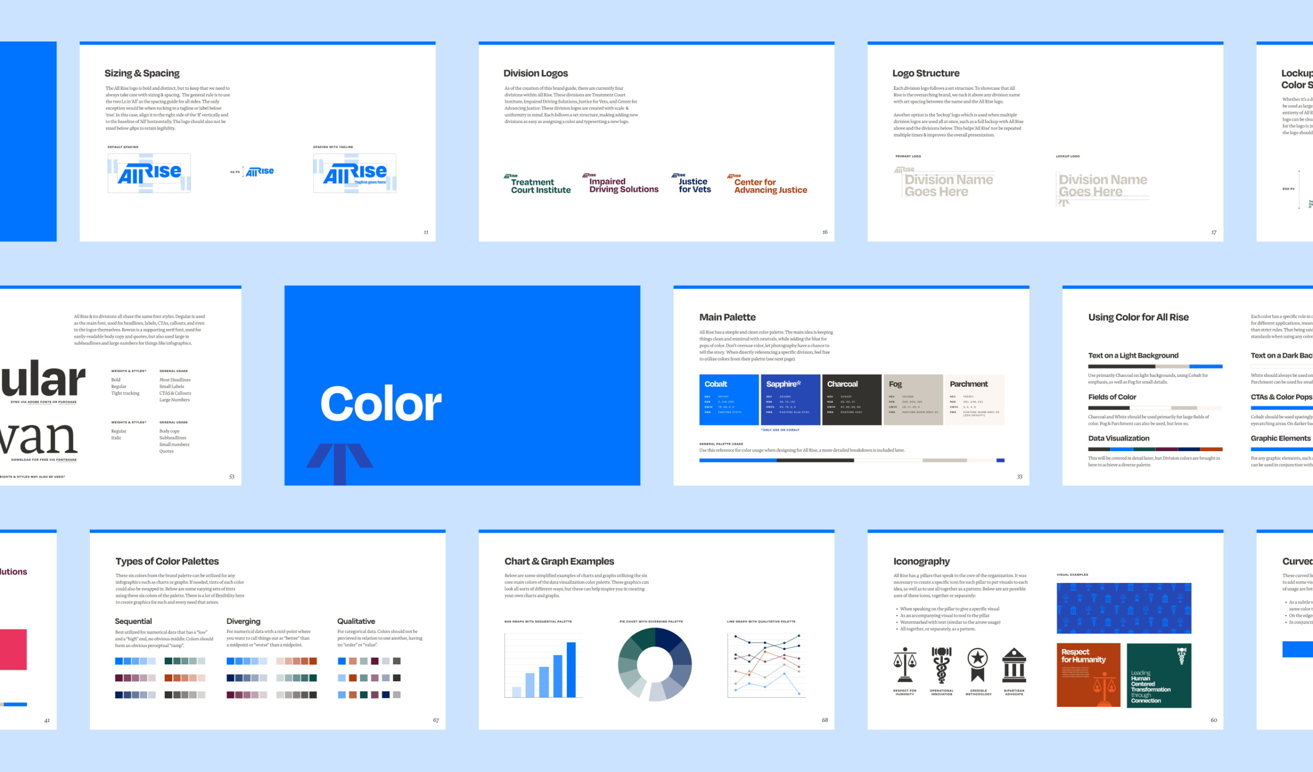
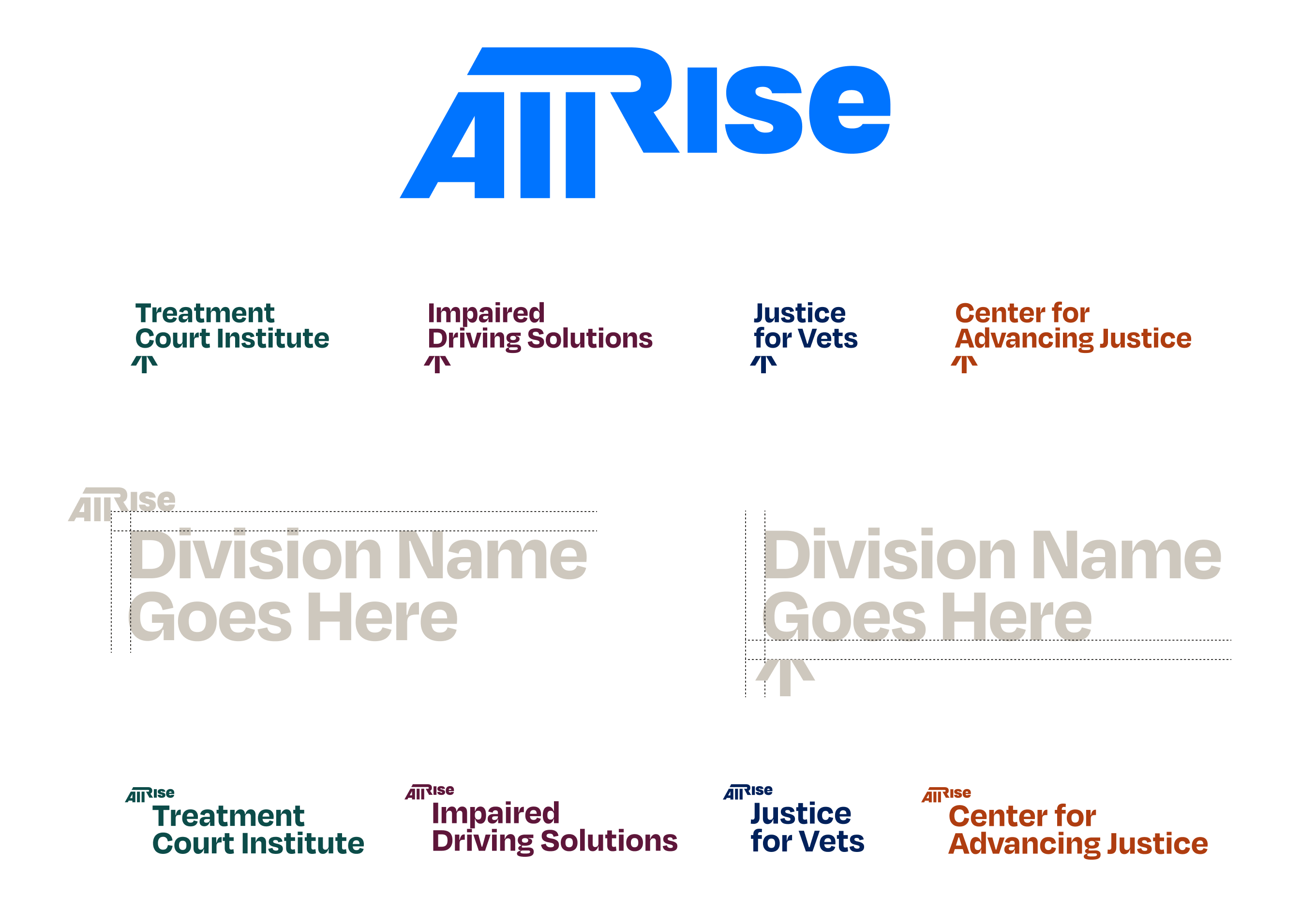
Once the core All Rise brand was established, the next task was making a whole suite of division logos that fit within the All Rise umbrella. One problem was wanting to include the All Rise logo in all, but not be too repetitive, as sometimes multiple logos will be included, all with ‘All Rise’ within them.
A few different lockups were discussed, a few different treatments were tried, but we settled on two versions: one utilizing the All Rise arrow, uplifting each organization, which would be used when in conjunction with the All Rise logo; the other is a simple lockup with a small All Rise above the division name. These logos are set up in a template, so the organization can easily add more divisions as it grows.
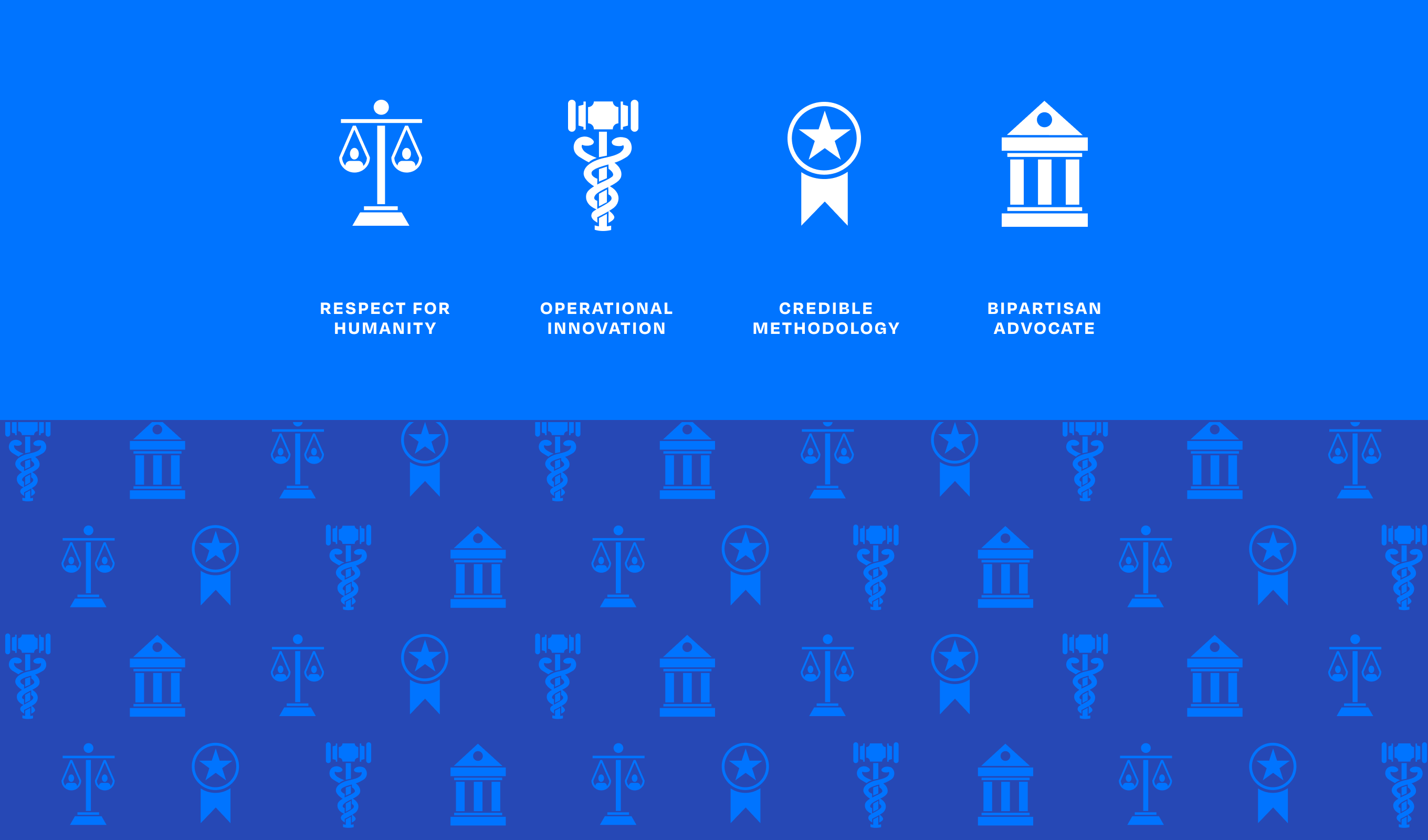
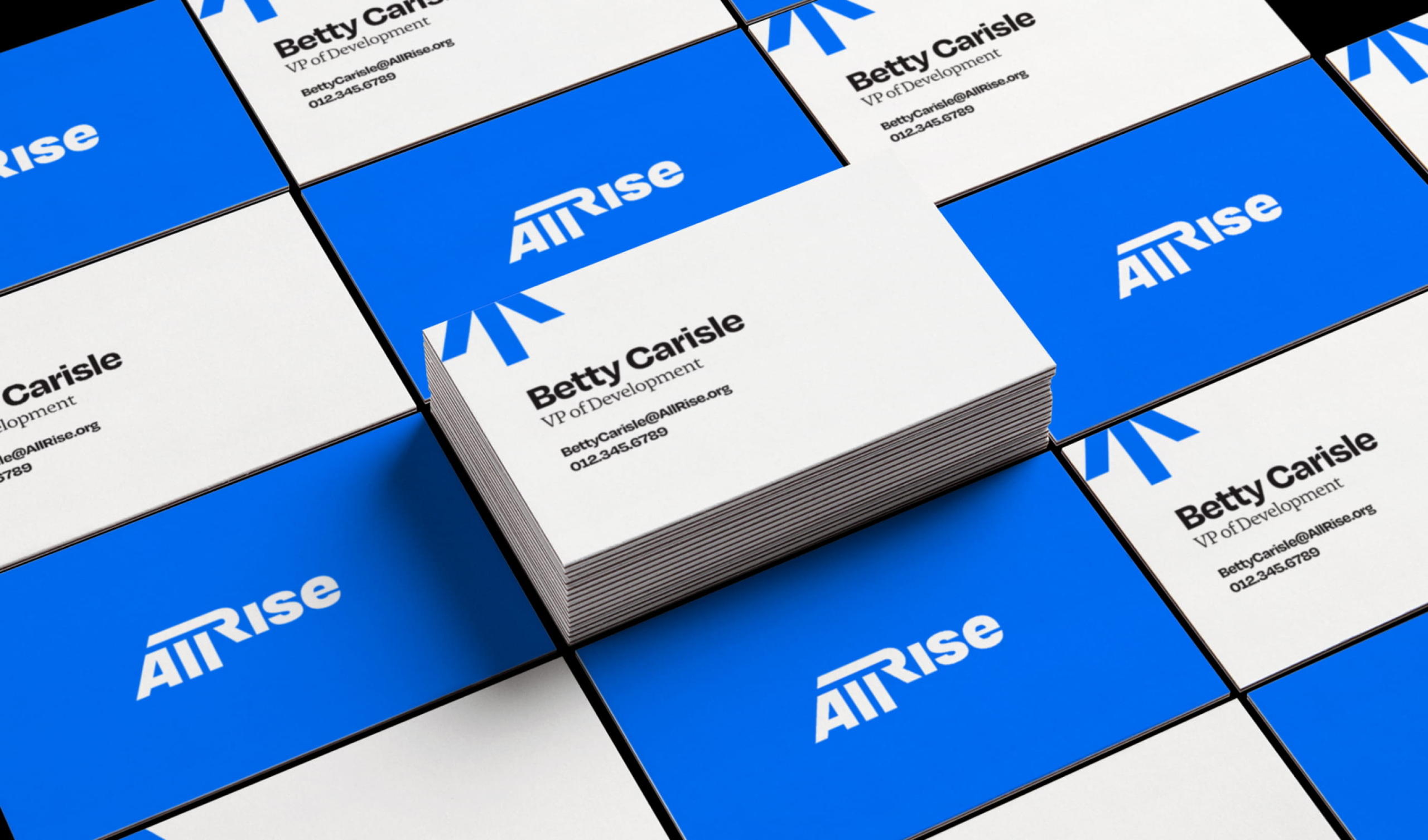

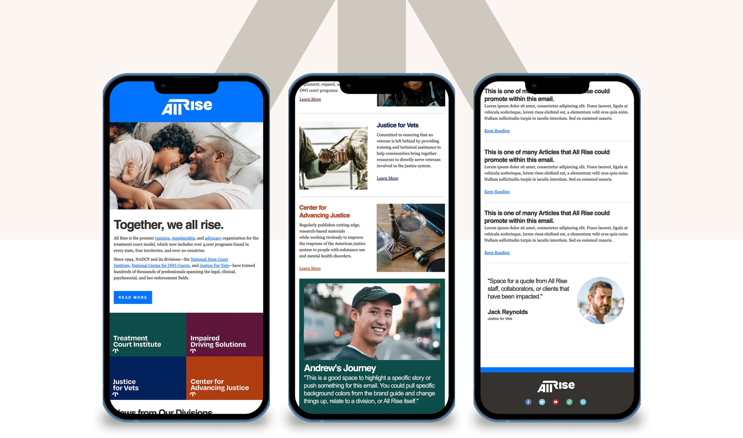
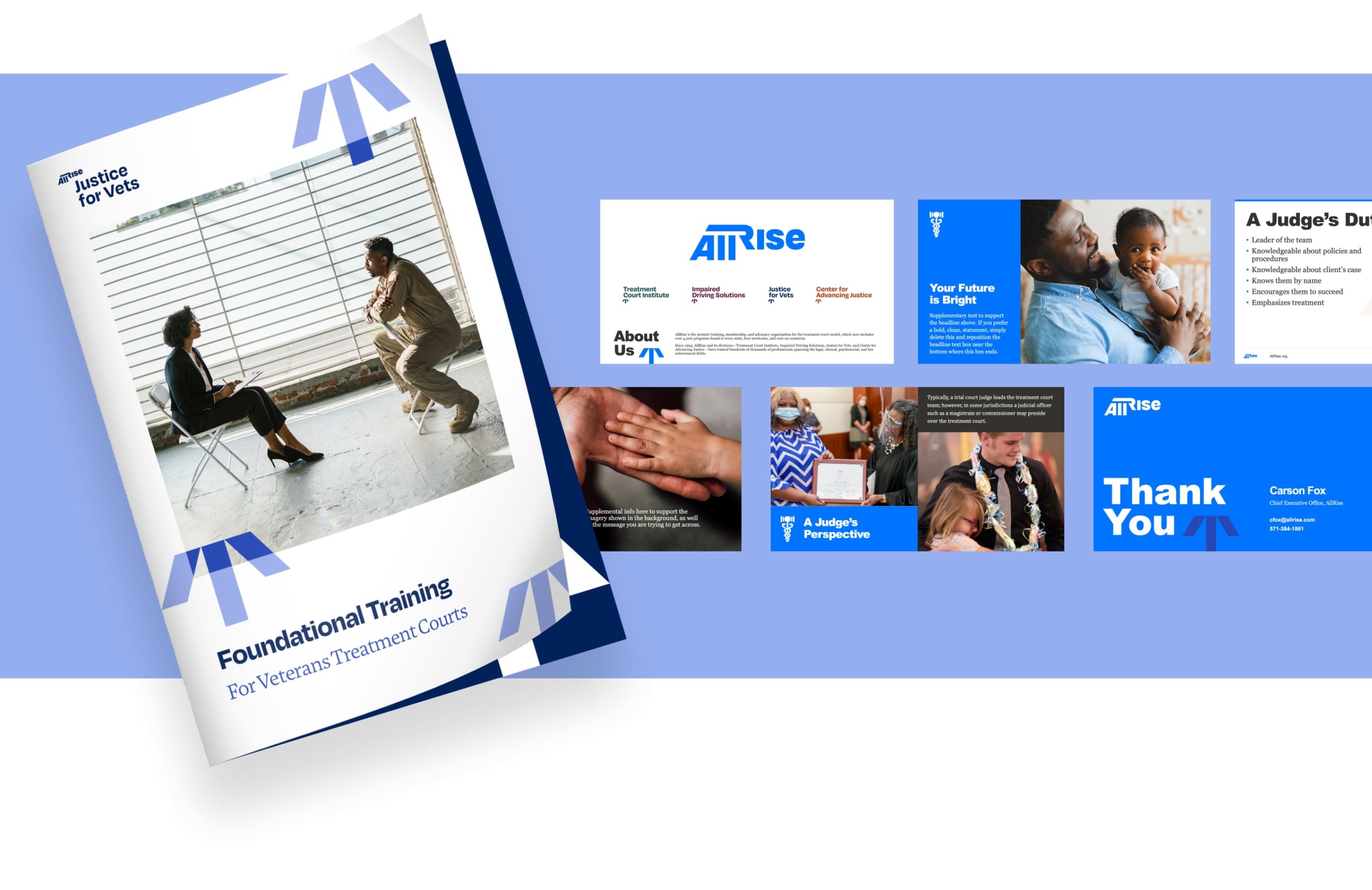
The entire All Rise suite is meant to seamless work together and separately visually. The core framework & styles for the All Rise brand is applied to each Division, simply using color coding per Division to differentiate each, all while keepting a cohesive look throughout all designs.


Reimagining the website for Kresge Arts in Detroit that celebrates and invests in the city's artists


The part where we ask you to cough up your email. So we can discuss all the amazing things we’re gonna do together. No pressure. Really.